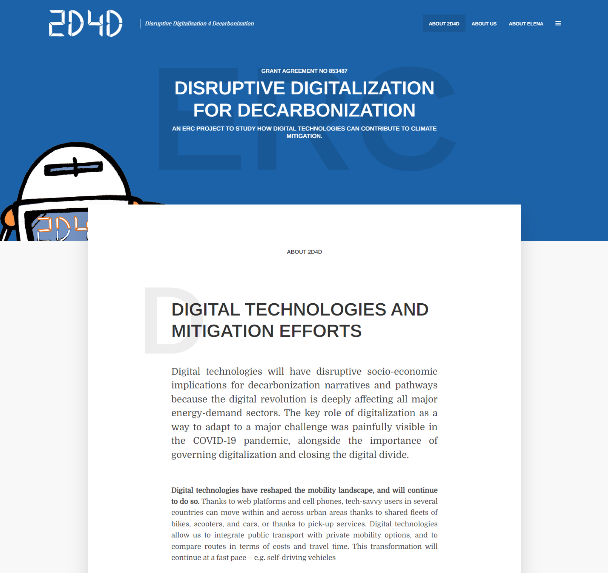
Elena Verdolini wanted a simple, yet stylish, website for her ERC project, based on some nice illustrations she already asked to be drafted and which she really liked. So we decided to give high prevalence to these illustrations and use them on the homepage together with an editorial which explains the project, waiting for the first results of the project to be published.
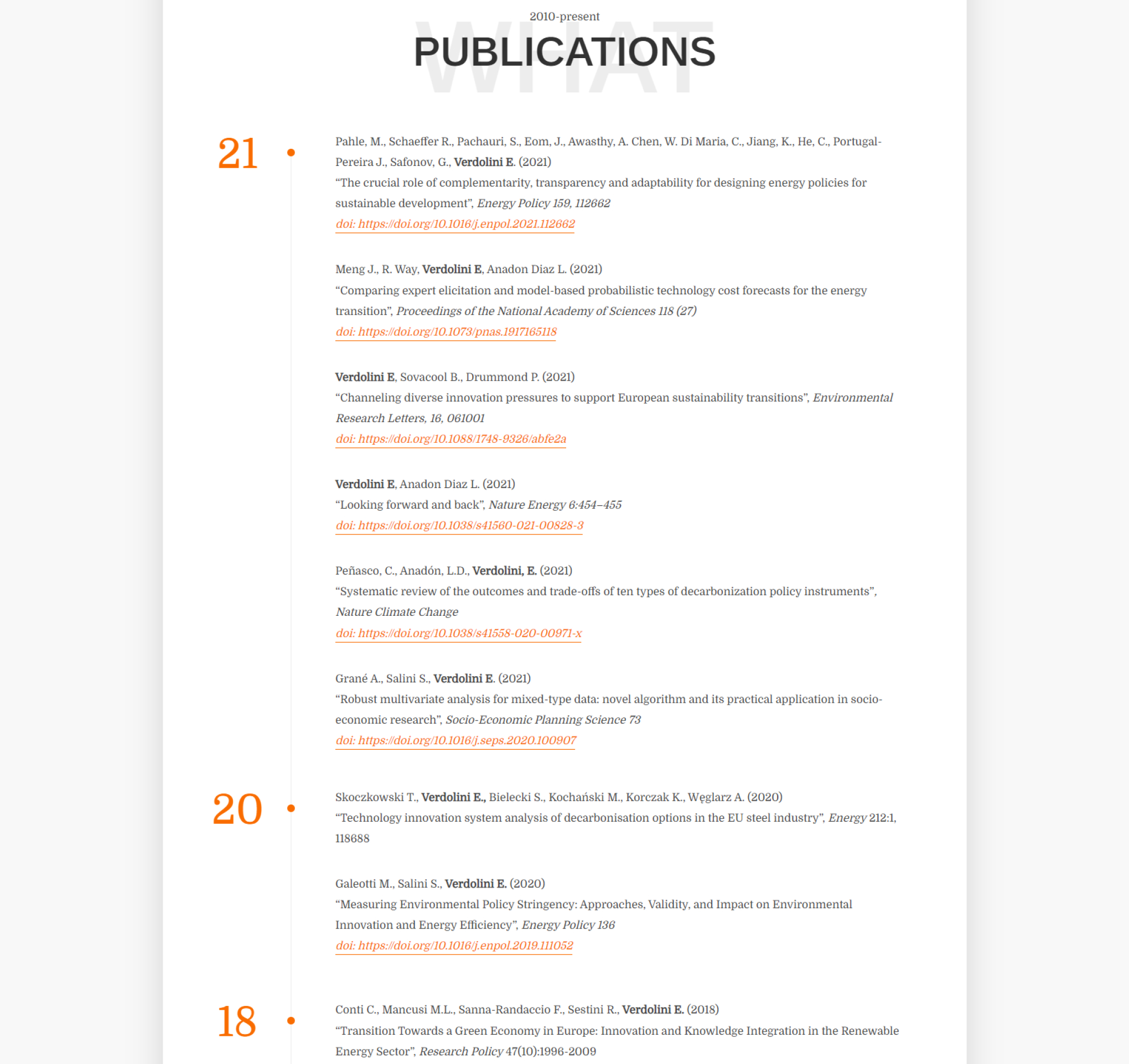
Elena also did not have a personal website showcasing all her publications an research activities, so she also asked us to incorporate also this information in the layout. Working together with all these constraints was a bit of a challenge, but we make it work in a nice integrated solution.


